Introduction to Color Theory for Games, Art and Tech
This is a beginner friendly introduction to color theorem for artists and programmers alike. I try to give a solid foundation to start understanding color by differentiating color as a light wave, activation of receptors in our eyes, perceptual model and color spaces and mixing. Based on this, I explore the important aspects of color theorem, color harmony and shaping emotions by association and important compositional aspects such as readability and visual interest.
This is a three part blog post. You can think of it as three separate blog posts in one. I recommend to read all three, but you can skip sections, if you are interested in a specific things. Just make sure to take your time, and take breaks in between!
- Part 1: Color as Light and Eye Receptors Activation
- Part 2: Perceptual Color and Color Spaces
- Part 3: Colors in Composition
Why Should You Learn About Colors?
Understanding color and learning to use it well is like having a super power. It gives you the ability to communicate with others on an emotional level, while it also helps you to visually package your images with higher clarity and readability.
For anyone who deals with the usage of color in creating images, this post can be of help to develop a greater understanding on how to use colors and work with those who do.
Introduction to Color, a Simple Yet Complicated Topic
On paper, color seems to be very simple. You have your Hues (red, green, blue etc.), saturation (the intensity/ richness of color) and value (how light and dark the color is). You can mix colors to create new ones, both by combining pigments as well as overlapping lights. Objects have colors because they reflect them, lights have colors because they emit them. Our eyes get hit by these reflected and emitted rays and an image is formed in our mind, like a camera.
Yet, I bet you could trick the most experienced painters into wrong answers, by asking them simple questions regarding what the color of a certain object would be under a certain light. This is due to some fundamental misunderstandings most people have about what color is, and how our eyes perceive it.
The study of color spans across many different fields. Painting and design, programming and computer science, biology and psychology and finally physics. While a painter doesn't need to have a solid foundation in physics, there is very crucial information scattered around all these fields, which are important set pieces to understand color as a whole. These set pieces are not complicated per se, but due to the lack of incentives, usually the information is inaccessible to the other fields behind technical jargons and formats that only make sense to those within the field.
It is also worth mentioning, it is not only the artist that would greatly benefit from some technical understanding of color, but also programmers benefit from understanding how colors are used artistically. Color manipulation tools, despite all the processing power we have nowadays are surprisingly inadequate.
Another reason why color is so confusing is a matter of semantics. We use the word “color” to define different things. The four I will be focusing on are: color as electromagnetic wave, color defined by the activation of the receptors in our eyes, perceptual color and finally color spaces used for programming, pigment mixing, etc.
Part 1: Color as Light and Eye Receptors Activation
Colors as Electromagnetic Waves
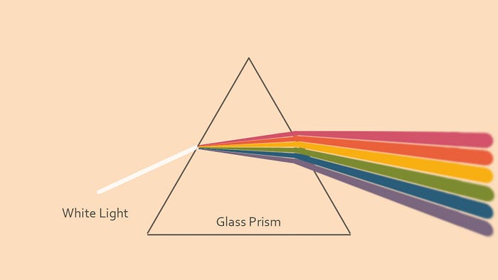
Light sources emit rays, these rays are reflected by objects and bounce around the space. Turns out these rays are actually waves with different wavelengths. We use the term “colors” for some of these waves. Below is a diagram you have probably seen a few times already.

The word color is used to describe the area of visible light spectrum. It starts with violet (400 nanometer) and ends with red (700 nm). All the waves in between those get a color associated with them.
These rays can overlap. For example, you can have a yellow wave and an red one going in the same direction sharing the space. When you overlap waves, you don’t “create” a new color. Overlapping red and yellow, doesn’t create orange (600nm). You still have your 550 nm and 700 nm waves coexisting together and superimposing on top of each other. If you already know something about color theorem (additive blending of light), this might already confuse you. How come we always combine light and see a new color being created? You can easily make an experiment at home, combining red and yellow, and get orange.
As I will explain in a later section, a combination of red and yellow only appears orange to our perceptual system due to its imperfection. But as far as light as a physical wave phenomena is concerned, nothing has been mixed: those rays simply overlap, and they can be separated again through simple methods such as using a prism.
Two paragraphs in, and you already see a common source of confusion. Understanding the above is important to understand how lights affect objects which they shine upon. Is is a very important matter for painters because they like to correctly paint this phenomena and for technical artists because they wish to write shaders that do the same.
A lamp (or the sun) shines light which consists of many of these different rays which overlap on top of each other (see figure 2). When a collection of lights hit a surface, some get bounced back immediately (specular highlights), some pass through (refracted light in transparent object) and some bounce a bit within the surface of the object, and scatter back out in a usually random direction (diffuse lighting). Beside the specular highlight, the other two are subjected to some absorption by the material they travel through.

So a summary of the above paragraph: if lights hit an object and bounces back, some of the wavelengths might get absorbed in the process. What wavelengths are absorbed are determined by the material of that object. For example, an object might absorb wavelengths between 600 to 700 nm (oranges and reds). If you shine a white light consisting of all wavelengths, after the bounce it will have all the wavelengths rays minus those which had wavelengths between 600 to 700 nm.

If this light then hit a camera or an eye, it will seem to have a blueish/greenish tint, as all the reds have been wiped out by the previous interaction. The color of an object is determined by which wavelengths it absorbs, during the time light is traveling through it.
Here comes typical confusion number two. Ask an artist to paint a blue sphere hit by a red light. They will probably paint you something like this:
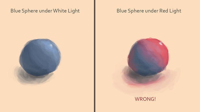
The side illuminated with red will be red, the other blue, in between a beautiful blend between blue and red, going through desaturated violet, with a (wrongly placed, topic for another day) white (where did white come from?) specular highlight in the middle of the area illuminated by the light.
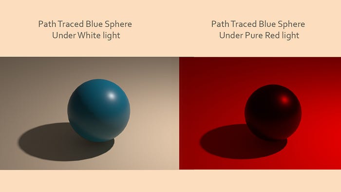
Here is a question: if the light consists only of rays with red wavelength and the object absorbs ALL wavelengths beside blue, how would any light reach your eyes? A blue material hit by a red light, can only be black. Look at figure 6, any light at all we see from the sphere is due to the specular highlights, which is the color of the actual light.
To be fair, I am cheating in the above question, that is why at the beginning of the article, I mentioned you can “trick” experienced painters into answering wrong.
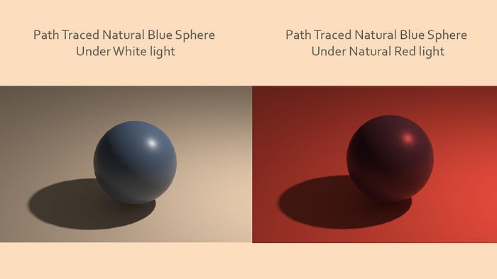
Most materials that are blue don’t absorb all lights beside a single wavelength and most lights that are red don’t consist of a single wavelength (you will see more of both in club where they want to give your brain an unusual experience). In nature your typical light consists of many different wavelengths with varying intensity and the materials absorb different wavelengths with different strength/ rates. This means, the blue material hit by a red light likely won’t be black but will have some shades determined by what exact composition of wavelengths the light has and the absorption spectra graph of the material. It is impossible to guess what these colors would be without knowing these 2 pieces of information. That is why studying actual real life references is crucial for painters and those who write shaders alike.
Here is the weird part number 3. I already mentioned two material with the same color “blue”, but very different output. Meaning the light that came back from the material under white light consists of very different wavelengths, but both are the same blue! Good time to get to the next section.
Color Defined Through Activation Strength of Our Light Sensors
How do we see? That is a rather complicated question. I will try my best to give the simplest explanation possible.
When light hits the back of our eye, it evokes a response from light receptors scattered around the back. You can think of these as sensors of a sort. When hit by light, they activate to a certain degree. The stronger the light, the stronger the activation. Our brain deduces an image from how strongly each of these receptors have been stimulated.
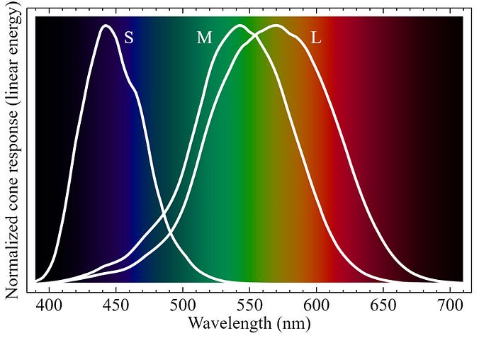
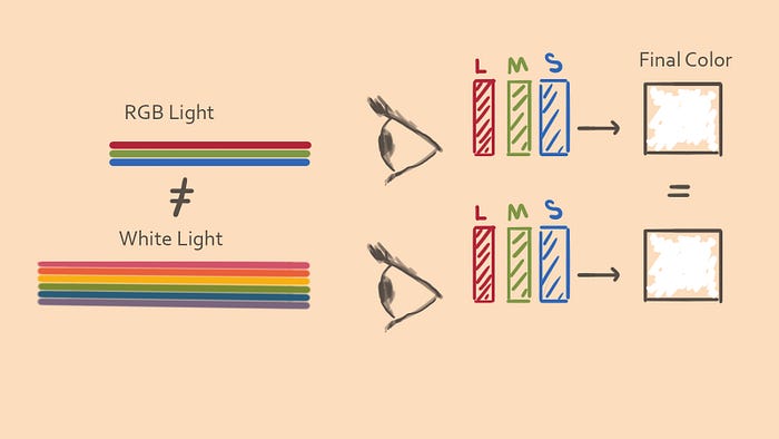
As far as color vision is concerned, not all receptors react the same to different wavelengths. A typical human has three types of color receptors. Each of these receptors shows the highest sensitivity towards a certain area of the visible spectrum. One has its peak sensitivity around red wavelengths, one around green and another around blue.
This doesn’t mean the receptor more sensitive to red doesn’t get triggered when hit by a different light like blue, it just means it will get triggered way less. In the graph below the sensitivity of these 3 types (S, L and M) vs each wave length is shown.
Our brain will receive simply three numbers. For simplicity let’s just assume a number between 0 and 100. When all three are activated fully we see white. When nothing is activated, we see black.
You might already see what is very wrong with this system. Let’s say we send orange light in an eye (600 nm). Let’s assume that respectively activates the M and L receptor types to 50 percent. Our brain will receive a number like (50, 50, 0) (L, M, S) for that part of the image. Now we replace the single wavelength with 2 different lights, red and yellow (550 nm and 700 nm). These two waves also cause the exact same activation in the L and M receptors (50 percent). Our brain has no way to know if the eye received a single wavelength or a combination of a bunch of different wavelengths, although physically these two scenarios are very different from another, we end up seeing the same color, orange.
Let’s draw a parallel between sound and light. We categorize sound waves with their frequency (related to wavelength), which is most commonly known under the musical notation of A, B, C, D, E, F, G and octaves. If someone plays an A on its own, you would hear an A. If someone plays a C, you would hear a C. If someone plays A and C together, you would hear both at the same time. But if our ears worked the way our eyes see, you wouldn’t hear A and C, but just a single B. Imagine listening to any piece of music, where all notes played close to each other in time, would merge and appear as a different note!
The reason for that is that our eyes actually only see in averages. That means each of the three activation numbers is a weighted average of the amount of light in the area which that receptor is responsible for. And many different combinations of wavelengths would look indistinguishable to our eyes because they trigger the exact same activation in the three receptor types.
You should know this intuitively if you think about an RGB monitor. These screens can only produce the 3 distinct wavelengths (Red, Green and Blue), yet are able to emulate all colors which humans can see (almost). The white which an RGB monitor creates, is indistinguishable to a white which holds many more wavelengths. The only way for us to know what this white really is, is by using methods beside our perception system, such as to run it through a prism and see what it breaks out to. Similarly, we never really know what color a material is, since we don’t know which wavelengths are being sent back from it.
A short summary of the above few paragraphs. Color, is in reality a phenomena that happens as a result of the activation of three receptors types in our eyes. All the colors we can see are, as a matter of fact, all the different combinations of activation these 3 receptor types can have. Although this color relates to the “color” which we associate with a physical ray of light, this correlation is quite shaky on many areas. For example, as a side effect of how the receptors work, color perceived by us has a circular nature. You might have seen the color wheel before:

If you think back to the visible light spectrum, this circle makes no sense, specially around the area between red and violet. In our spectrum, red and violet (700 and 500 nm waves) have as little to do with another as gamma rays and microwaves. But perceptually, these two are next to each other on the color wheel and seem to be similar. There is a color between them that can not be represented with any single wavelength (you can’t create a laser beam with that color consisting of just one wavelength ray).
It is important to understand that color is a phenomena that happens in our head, and not get confused by the term “color” assigned to a section of electromagnetic waves spectrum which evoke the same response from our light receptors. Graphics programmers and tech artists usually have a good understanding of color up to this point. As a matter of fact, color spaces are usually based on the perceptual activation models (XYZ), which are more convenient to calculate than the spectral models.
Part 2: Perceptual Color and Color Spaces
Perceptual Color
The color our eyes see is not actually the color we end up seeing in our mind. There is a post processing of a sort that happens in our brain, you can think of it as a combination of tone mapping and color grading:
Color as light waves -> activates receptors in the eye -> tone mapping and color grading = Perceptual color
The information provided by our eyes is the raw input. It is noisy and imperfect (there is for example a big blind spot in our eyes). Our brain has all sort of clever optimizations and processes. Reusing information from memory, and temporal manipulation are some of those, just to name a few!
There is a tone mapping of a sort where values get remapped and normalized to a range that makes sense. A good example of this is the relative brightness of surfaces. The blue sky might be many times brighter than your computer screen, but only appear slightly brighter. This remapping is useful as it visually distinguishes things that actually matter in favor of differences that are not all that important.
Common side effects of these post processes in our brain are optical illusions. Our understanding of color is contextualized. Desaturated reds will look blue to us in a dominantly strong red color scheme.
Certain colors will appear bright in some context and in some darker than what they really are.


There seems to be even the chance for our emotional situation to affect how we see colors. Certain colors might appear more intense, based on the state we are in at the time. In turn the colors that we see affect emotions based on what they remind us of.
We already lose a lot of information going from color as light to activation of receptors. Then this information still gets processed in a bunch of lossy and destructive ways. Do we see anything that accurately represents the world around us? Yes, but way less than what your average person assumes.
As this is a summary, I didn’t get into the rods. They affect color vision in interesting ways (such as moon light appearing blue, in absence of the cones/ color receptors). I also didn’t mention that our eyes don’t have an equal amount of color receptors between the three types and how this affects how bright different hues categorically seem to our eyes.
All color harmony and color design happens in the perceptual space of color, since that is how we see things (important for creating readable images), and where emotional response happens. Hence the perceptual model is the main focus point of many disciplines of art, such as cinema, painting, architecture etc..
Color Mixing and Color Spaces
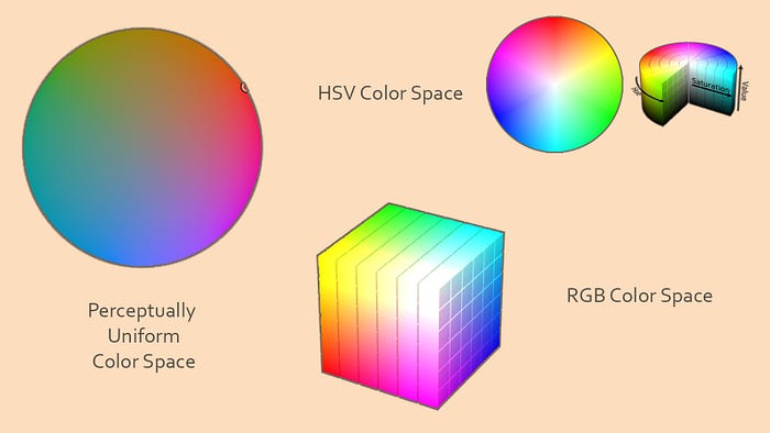
A color space is a certain arrangement of colors in a system where each color relates to one another through a set of basis (axes).
Think of the basis as information fields in the birth certificate of a color. Once these fields are filled in, they create an identification for that color. With it you can save colors for later use or apply operations on them such as blending or multiplication.
If you are a game developer or a digital artist you regularly use spaces such as the RGB (Red, Green Blue), or the HSV (Hue Saturation Value). We already mentioned the XYZ color space, which defines all the possible activations our eyes can have. Also there is spectrum based color spaces, where the wavelength and the intensity of the ray are the identifier information defining the color. Very useful color spaces are perceptual ones, like CIELAB color space. These attempt to define a space that best describes how color is mapped in our mind. In perceptual color spaces, one unit of change in the color space along its basis, will cause a change in color which perceptually looks equal, regardless of where in the color space you are. This is not the case for RGB or HSV, for example. Notice how in the HSV color wheel, one degree of change around the circle in the red-orange-yellow area, generates a way bigger perceptual change, than one degree of change along the greens, cyans and blues.
There are also color spaces for traditional mediums. This is where all the (rather pointless outside of this context) talk about primary and secondary colors come in. Mastering the color space you are in is important. It allows you to have more vibrant prints, better looking videos or games, mix colors better for your watercolor etc..
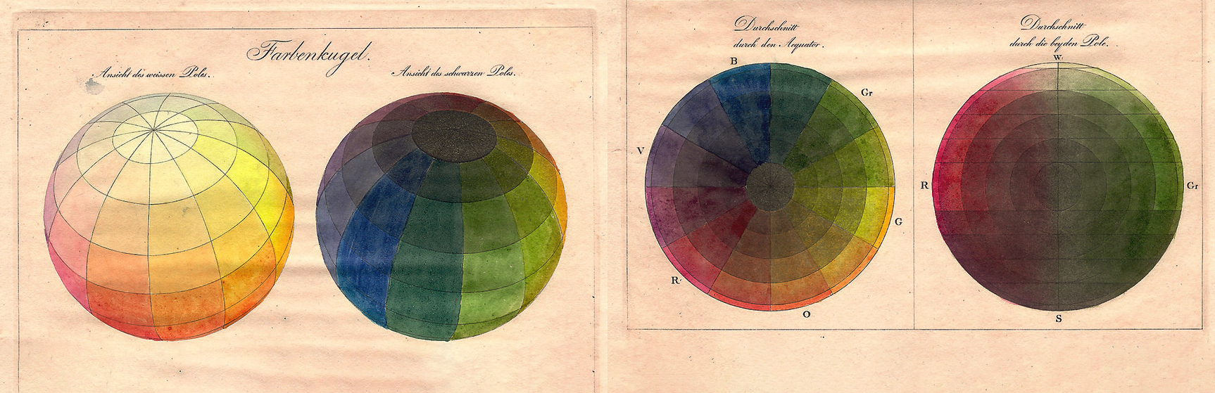
Traditional artists usually utilize a color space formatted like a color wheel for their pigment mixing. They create a look up table of a sort by trying to create a perceptually uniformed distribution of color along the circle. The color around the circles makes the basis. Some have separate maps, noting how to mix these to get gradients between them which have perceptually equal steps. Below is such an example for water color:

This is incredible, and you should do it if you paint traditionally. It helps you to be able to correctly mix colors to get the color you want. However, don’t use this color space to guess how a material is affected when a certain light shines on it, if you aim for a realistic depiction of a scene.
With RGB you can simulate all the different colors as a result of eye receptor’s activation. That doesn’t mean that if you convert a light to its RGB representation, convert a material absorption graph also to its RGB equivalent, then multiply one with the other (to simulate the absorption of color by the material), you would get the same result as what happens in the reality. The reality is based on a continued domain of wavelengths interacting with the material.
Practically, using the entire spectrum is not doable for real time rendering, or even offline rendering due to memory and performance constrains. That is why we usually use RGB.
The mixing of color in a color space (linear interpolation or, in the case of traditional color wheels, a line that connects two dots on the wheel) would give a different color based on the color space you are in. This means painting with lower opacity brush or blending transparent layers with one another, will give different results based on your color space.
Part 3: Colors in Composition
When we talk about good composition, we usually mean an arrangement of visual elements which communicates a subject matter; creates an emotional charge which supports the core message and lastly looks visually interesting and intriguing. There is ALOT packed in the above sentence, which I will cover more in depth in a future post “Introduction to Art Direction for Games”. The focus in this post is the role color plays in creating such image.
In order to be able to successfully pick a color scheme for your art work, VFX, game, film scene etc. you need to first answer these questions as extensively and as accurately as possible.
- What do you wish to convey with this image? What is it that you are actually making? For who? To what propose? Build a hierarchy of importance in your answer: the main point in this image or scene is A, second place is B, third C.
- What is the emotional charge of the message? How do you want the viewer to feel as they consume this image.
If you are unable to answer these questions, you can experiment around until you do. It is important to know that knowing the answer to these is crucial to effective communication with enough consistency for the entertainment industry. If your concept fails at the level of these tests, no color scheme can save you. For example, if your hierarchy list gets too long, you are doomed to fail. There is only so much you can communicate in a single image.
Having the answer to the above question, you can proceed to pick your color scheme by thinking about these three points: readability, emotional resonance and lastly visual interest.
Readability
Readability is in my opinion the most crucial aspect of a good composition. Regardless of how fantastic your concept is, it is hard to justify its validity when your target audience doesn’t understand it. Color can aid you greatly in effectively communicating the point of an image.
For example, can you tell me which of the squares are the “special” square in each of the following three images?


Poor choice of colors, can truly confuse a person. Can you tell me in the following picture, which square is the “special” one?

A choice of color can even fail at a more fundamental level. Compare the two images below. In one you can clearly see the subject matter, in the other the subject matter is barely visible.

How does the above apply to a painting, VFX, scene of a game or film? The first example is a good example of the use of a color to make a shape stand out. Replace the cubes with people, then the special one would be the main character.
The second example is where there are too many colors. This is the bane of photography in real life and non theatrical films, where the colors on the set are not carefully designed. The easiest way to increase readability is to reduce the amount of visual information being conveyed. Filtering the noise causes the signal to be more clear.
The last example is a case where poor choice of color doesn’t provide enough contrast to be legible in the intended viewing condition. This is especially a poor choice for moving images (games, vfx, films, etc.). Imagine the enemy being so low contrast that you keep loosing track of it during gameplay.
You might even want to decrease the clarity sometimes. For example, you wish to communicate the sense of confusion the main character of the game, film or painting has in that scene.
It is not about maximizing the readability of all the objects in the scene at all time, but increasing the effectiveness of what it is you are communicating. If you want to introduce a menacing boss, it is a valid choice to keep him hidden through low contrast colors to increase suspense and tension.
You can create contrast along all the dimensions of a color space (value, hue, saturation, etc.). A color and its complimentary have the largest contrast along the hue axis. There is much debate on which color wheel to use to determine the complimentary. The important thing is the general point that colors on opposing sides of the color wheel generate more visual contrast next to each other.
Of course everything mentioned in this article applies to a single painting, design materials or photographs and by extension a series of them making a game or a film. You can take these lessons even to 3D for architecture and interior design or VR.
One thing worth mentioning regarding readability is color blindness. Ten percent of Caucasian men have a form of color blindness. It is important to keep that in mind when you are designing your contrast, or the lack of it. This topic is bigger than what I can cover here. You can look at the further reading section for some good resources to learn more about this.
This is a good time to talk about color harmony, a tangent that is relevant to all three areas of readability, emotional charge and visual intrigue.
Color Harmony
Most texts on color theory have color harmony as one of main areas of focus. I will cover this very briefly. This is not because color harmony is unimportant, but because color harmony has been covered very well by others (look at further readings section) and I think it is actually quite a simple topic that doesn’t need too much discussion around it.
Picking harmonic color schemes is so simple as a matter of fact, that you can do it programmatically. I wrote about a few algorithms I have tried over the years in my Procedural Color Algorithm post.
Harmony in colors, very much like harmony in sounds, is about relationships and ratios. We are constantly trying to make sense of the world around us, to spot patterns in the chaos. When we spot such a pattern, we feel well and content. When we can’t figure it out, we feel unease, at the mercy of a randomness we don’t understand. To pick a harmonious color scheme, we simply need to ensure that all the colors in the palette relate to each other in simple ways. The color space we establish these relationships in should be a perceptual one.
The easiest way to ensure harmony is to make sure the image has a very limited palette. The more points in the color space, or colors, we pick, the harder it becomes to balance them in a way in which they look perceptually harmonious. The most surprising thing for people who start with the color theory is just how limited a good color palette is. Do a study of the color scheme of your favorite film, painting, photographer, game and you will find that the majority of the scenes contain something between 1–3 or a maximum of 5 hues, with a well defined range and clustering of saturation and value. When it comes to harmony, less is truly more.

Below are the popular schemes which people use to generate colors which perceptually relate with each other. You can come up with them on the spot. It is about mathematical ratios between picked colors, and there are only so many simple ways you can pick new colors that relate with the rest.

Picking colors that are readable, and filtering out those that are not harmonious still leaves you with an endless combination. How do you choose which ones to pick?
Shaping Emotions With Colors
This is the most difficult part of picking colors, and the least documented part! Good colors make us feel things. Visual queues can remind us of a memory, a sensation or a situation (summer noon, autumn walk through a park, Christmas Eve, etc.). These trigger the emotions we associate with those memories.
We want to pick colors which generate emotions. These emotions should have a resonance with the message of the image. In other words, we would like to align what we are saying, with how we are saying it.
To be able to do this, you need to get in touch with your emotions and train your emotional sensibility towards the images you see on a daily basis. Watching films, playing games, reading comics, looking at paintings or even going for a walk, ask yourself: “How does this image/ scenery make me feel?” What part does color play in it? If you find a color combination that makes you feel a certain way, you need to develop a way for your self to categorize it.
I like to take a photo with my phone, and then color grade the image on the phone, while I am there, until the image carries the same emotional impact as the scenery. Once home, I save the colors in a color script which I tag with few words describing the emotions:
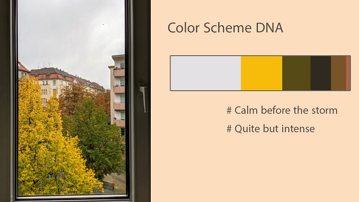
Notice how this “DNA” not only documents the colors in the scene, but also their distribution. If you change the above so that the white and the black switch places, it will generate completely different emotions.
This becomes your tool box. You don’t need to start from zero in production. Whenever you need a color scheme that needs to generate a certain emotion, you can go through your libraries, pick some color schemes and then start there.
You can also search for a good start. I like to go through Pinterest, looking at random images. Shoes, fashion, architecture, landscape, etc. and put on a board whatever makes me feel in a way that matches what I want to achieve.
Here is an example of such a board:

Either way, you need a starting point. Your starting point will rarely be your final color scheme. Next comes iteration. Let’s say your emotional end goal is peace. You ask yourself: “Does this color scheme make me feel at peace?” Could I improve it by changing it in a direction? You make the change to test your theory, compare the before and after, and ask yourself if you feel more at peace than before.
This is the reason why you need to be emotionally tuned in. Your emotions are the compass which guide you to your final color scheme through the iterations. There are, of course, rules of thumb you can use or just experience to speed up the iteration phase. Things such as: darker images are generally moodier, lighter ones have a happier tone, images that have high contrast generate a lot of drama, energy and tension, whereas lower contrast ones create a quieter, almost bland emotion, etc.
Shaping emotions with color schemes is highly subjective and culture dependent. It is easy for designers to design visually interesting and readable images for those who don’t share their upbringing, but the same can’t be said about emotional resonance. Your audience needs to have shared the memory which the colors remind you of, in order to get the same emotional response. It is equally important for programmers to understand that they can’t achieve emotional impact in a procedurally generated color scheme, without factoring in the human experience.
A good example for me is the color of the sky in the Middle East. From the orientalist painters, I can immediately tell who has actually been to the Middle East. At times, there is a very strong tint of blue in the sky over there. This specific tint of blue immediately transports me to high noon somewhere in the mountains in Iran. I can feel the strength of the sun and the stark contrast with the coolness in the shadows. Amazing what colors can do, no? Except this effect is lost on those who don’t share this experience. To them, it is just another blue sky!
Visual Interest
At this point you should have a set of colors for your project which are readable, harmonic and generate an atmosphere/ emotional response which resonates with the message of your image.
Visual interest is the icing on the cake. It is what gives the colors the final pop. Having said that, this is in my opinion the least important of the three. Having an interesting color scheme that doesn’t read or carry an authentic emotional message is pointless.
The principle behind visual interest is simple. As mentioned before, our brain tries to spot a pattern in everything. While doing it, it is engaged and interested in the subject matter. Once it has figured everything out, it loses interest and disengages.
The key to visual interest is variation. If you add too much variation, the patterns carefully laid out in color harmony get too complicated and the image becomes chaotic. Add too little, and the image becomes predictable and boring, with no kick or surprises.
Your image will ideally end up with 2–3 hues. The value and saturation range should also be a constrained, limited distribution, clustered around certain poles. Once you lay out your image, if it looks too boring, diverge a tiny bit from these well defined rules. Add a bit of chaos. Perhaps some hues that are slightly different to your chosen hues. Or widen the range of the clusters in saturation and value. Break the monotony of a color in an area dominated by a color or pattern, with an unexpected color. Repeat this until you are either satisfied with the image, or it has become too chaotic. Keep iterating back and forth, until you reach that fine balance between order and chaos, where true magic happens and your image comes to life.
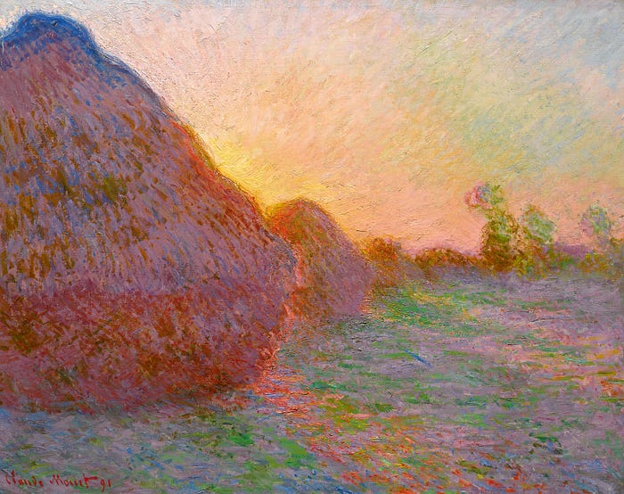
Some painters have this embedded in their painting style. Monet would be a good example. Although the general use of hue is limited, each brush stroke has a slightly different color. This adds endless variation and creates a captivating image.
Conclusion and Further Reading
This became a longer post than intended. Still, I left many things out. Here are some resources where you can read more about the topics mentioned.
If you wish to know more about color as light, activation of receptors or perceptual color system, in the context of practical use of color, the best resources I have read are books on graphic programming. They usually have a section dedicated to radiometry and color science. Though these books are very technical and will be challenging to those who are not in the field. Some of the good ones are Foundation of Game Engine development: Rendering, Graphic Codex, Real Time Rendering, Physically based Rendering, etc. An old favorite of mine which tries to bridge the gap between color science and art is Handprint. Although I personally prefer reading the tech books on it.
There are plenty of Art books that cover both color harmony, as well as color mixing. Some good ones are Color and Light by Gurney and Color Choices by Quiller. Handprint also has a lot of entries on these. Photographers are quite good at creating harmonic color schemes, since they have to start of with the busy original image. My favorite video on the topic is probably from Joanna Kustra: Secrets of Color Grading, since she doesn’t just cover the popular color schemes but also practical ways of achieving them.
For emotional resonance and visual interest I strongly recommend Vision by Hans Bacher, an incredible book. The best way to learn about these two, though, is by consuming art. You need to learn to consume art actively, paying attention to the mechanics of the image and how it affects you. A fun challenge is to take a frame of a film with a well established color scheme and try to change the emotional message of the scene by adjusting the colors.
If you are looking for studying colors in film, animation and games, you might want to look at some art books. I love the Color of Pixar, a library of different color schemes used by them. There are too many good art books out there to name, but be aware that these books don’t hold your hand and you need to extract the value out of them.
Last but not least, resources on color blindless. There is a very good GDC talk on the topic. It not only covers the different conditions, but also gives tips on how to design with color blindless in mind.
That was it, I hope you enjoyed reading. You can follow me on my twitter IRCSS