Creating Painterly 3D Scenes: preparing assets for NPR
Creating painterly art style in games and preparing assets for NPR (non-photorealistic rendering) requires more than just fancy shaders. In this post I will cover what I learned from my 3D painterly style studies made as scenes for Sketchfab.
A while ago I turned a watercolor painting to a 3D model using projection mapping and recently I stumbled upon a video by Lightning Boy Studio, guessing Arcane’s workflow for getting the painterly look, which motivated me to take another look at the projection mapping technique and see what I can get.
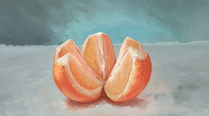
The first model was a still life study of an orange (which you can see on my Sketchfab)
For the second study, I decided to take a more complicated subject matter, a floating castle on a turtle, which you can also view on my Sketchfab. This was very much inspired by the works of Gregory Fromenteau.
I am not going to go in depth on the specifics of making these models, since that part is quite straight forward. Projection mapping with photoshop and blender, and painting the model bit by bit from all different directions. For the second model, I kitbashed two photogrammetry models together to get the base mesh.
What I would like to cover is some general tips on how to make 3D scenes look painted. For this, we first need to talk about what the painted look even means!
What Makes Something Look Like a Painting?
I am going to go on a minor philosophical tangent.
Realism is an important marketing word in the video game industry. Every year, people obsess over how much more realistic the new games are. This usually confuses me, because most of these examples don’t look realistic to me at all. A good example is the recent (in 2022 at least) Japanese train station demo in UE5, made by Lorenzo Drago.
Look at the sky area. The sky is over blown due to the over exposure. Although our eyes wouldn’t have any issues with a dynamic range like that! The viewer’s perspective in the demo/video is shaky, it moves and rotates around, but our heads don’t do that either!
The key point is that this is not realism, this is photorealism. What it tries to imitate is not the human experience, but the experience of a camera! Or perhaps more accurately, the experience of a human looking at camera footage.
Focusing on how the camera sees the world is a popular pastime not just in the game industry, but also in the fine arts, films, etc. We add things like vignetting, chromatic aberration, lens flares, low dynamic range, etc. to get closer and closer to the camera’s behavior. Funnily enough, the engineers making cameras, have spent decades taking these defects out of the camera’s sensory setup.
This focus on photorealism is not without reason. Think about it, how much of the world have you truly seen with your own eyes, and how much through the lens of a camera? We all have a solid image of the Earth from space, but only a hand full of us has ever been to space. We know how the Great Wall of China, the Great Pyramids or a subway station in New York look like, despite having never been there. So much of the mental image we have of the world, has been purely formed by the images we consume through the lenses of cameras! This is even more so the case for the current time, with the popularity of streaming and Tiktok videos. Something is Realistic if it conforms to the image we have in our mind, and what we have in our mind is becoming more and more defined by the camera’s sensory system, rather than our own personal experience through something like a walk through our local park.
What does this have to do with making games and 3D scenes that look like they are painted? (/end tangent). When we mention stylized games that imitate art, many might think of expressionism or impressionism with their visible brush strokes or of Moebius’ outlines and his flat colors. But there is so much more to paintings and art. Look at this painting by William Bouguereau.

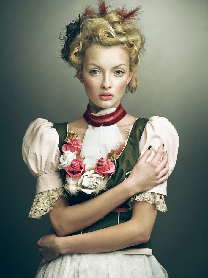
This looks realistic, yet our games don’t look like this. Why not? The main difference between painterly naturalism and photorealism is in what they imitate. While photorealism focuses on recreating the camera’s vision, painters focus on reproducing the human experience! These are two different things because humans’ sensory system has some major differences to a camera on a fundamental level. You can take any photo or video, for example, and try to recreate the human experience with it too, and usually you would end up with something that looks closer to a painting. An example is this photo taken by Joanna Kustra.
All in all, there are quite a few key differences between paintings and your typical 3D renderings. While I can’t mention them all, I will focus on some that are important. Texture, colors, light, edge quality and projections! What I won’t cover are things like shape design, careful placement of forms, etc. These are equally important, but games with good art direction, photorealistic or NPR are already doing these through stylization and careful camera movement!
A lot of images ahead, if you can, zoom in on them and pay attention to the relevant details.
Textures
“We dont need to show every single branch on the tree (…) but show its properties” said Luis Antonio in the Art of The Witness. Look at the two examples below.
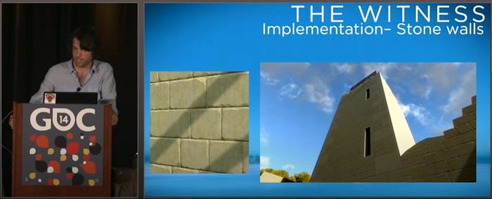

PBR (physically based rendering) game textures are usually wayyyy too busy. They have details everywhere, at all time, from all angles. This is not how we see the world, nor how painters paint materials! Real life is a lot blurrier. Our vision is not only imperfect and needs the brain to fill in missing details, but also a master at optimizations! Our brain constantly makes assumptions and changes the sensitivity of our receptors. It uses our memory to make guesses about how things look, to fill in gaps or just to not redo the same work of deciphering visual information! That means we don’t see all texture details everywhere like a camera. By not see I mean not notice: those details are irrelevant to our viewing experience. Of course if we focus on any area, we will see the detail of that area.
When we are passively looking at a surface, our brain gets rid of the noise. It focuses on the essential properties of the texture. These key properties are what mostly define the texture for us, and are what makes it unique. We usually associate these properties with certain physical, sensory or emotional traits of the surface. For example, cracks that make a surface dry or curvatures that make a rock solid or color variations that make marble cold.
Artists spend a considerable amount of time, learning how to extract the essence of a texture from a material!

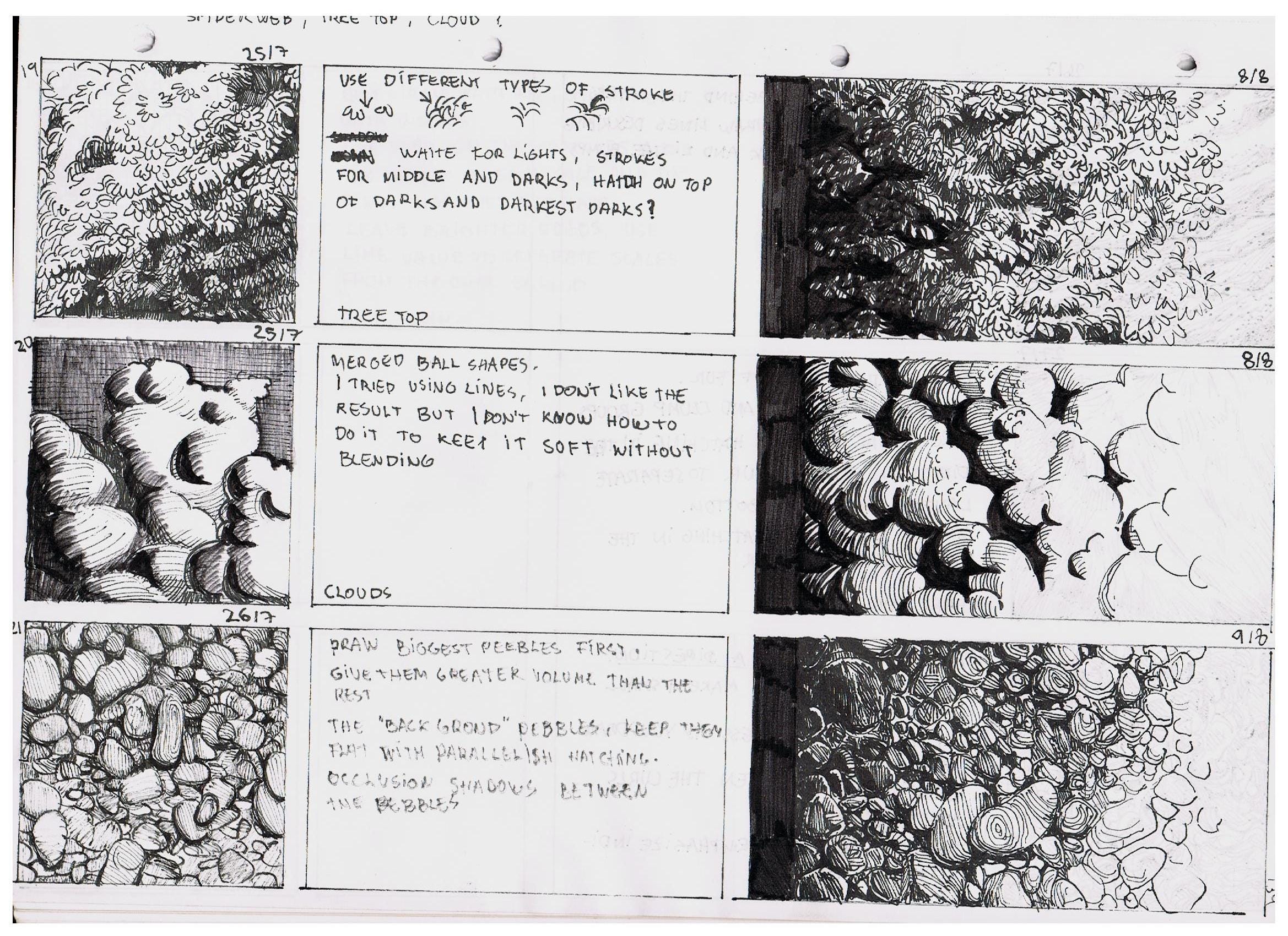
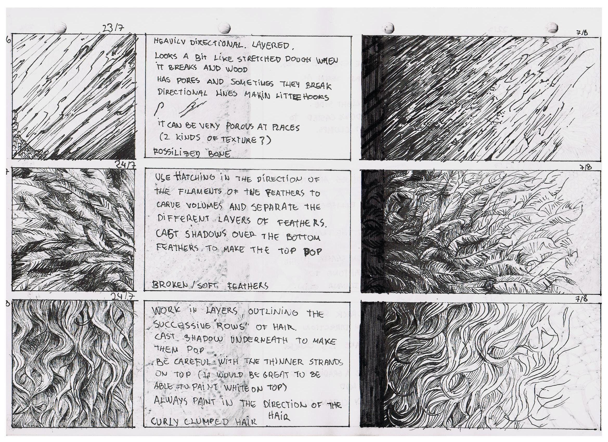
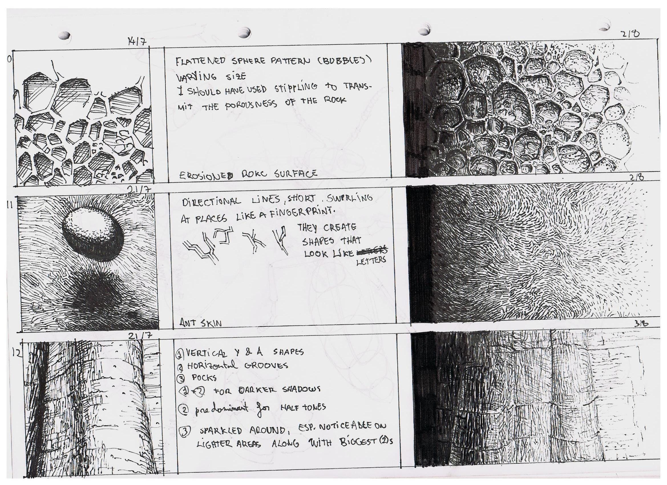
Like most things I say in this blog post, this is not confined to any specific style. Below you have Chinese ink brush painting, Japanese woodblock prints and an European romantic painting. All excellent examples of simplified textures, where the relevant parts are exaggerated.


So next, when authoring assets for a NPR scene, make sure to simplify the textures to their core. Shader wise, you can still blend in some noise if the player gets really close for visual interest but assets sitting passively around the scene shouldn’t contain so much information!
Colors
Colors in a painting are deliberate, carefully chosen and restricted. I could write a whole blog on it, which I have. So give that a read as I won’t repeat myself here. A lot of the stuff I mention in that post is about creating harmony and visually pleasing images. In real life, there are way more than 1 to 4 hues, and the saturations and values are all over the place. Yet, I still claim picking colors like a painter is more realistic. While it is true that the real world is full of chaotic and irrelevant colors, that is not how our brain saves that memory, and once recalling it, not how it remembers it! Remember what I said about realism and conformity to our mental image of the world: that mental image is mostly made up of memories since the present makes up such a small part of our mind. That is why some film directors don’t visually plan scenes how they would really happen, but how you would have remembered them happening!
One of the fastest ways of getting that painterly look, is to use beautiful and simple color schemes.
Light
I love the image below. The first time I saw it was on a tweet from Morgan McGuire, with a line “This is the reality we are trying to match”, within the context of rendering and render engines imitating films.
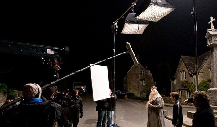
Lighting in painting is a device. It is used deliberately to highlight things, create mood, separate objects, etc. Go through masterpieces of art, and you will find out that they don’t have physically correct lighting at all. Although real life is again all over the place, these carefully painted fake lighting conditions look more natural and realistic to me than any photorealism I have ever seen.
This has in part something to do with the memory aspect of things and how we remember a scene as mentioned before. But also partly because how we picture an object is not bound to a single perspective (more on that later) and lighting condition. Think of a horse and try to imagine it. You might picture a horse from a certain angle, with colors, maybe a surrounding environment, and maybe somewhat coherent lighting. But you have seen a horse under so many different conditions and the prime image of the horse you have in your mind doesn’t have a fully accurate PBR renderer attached to it. The horse you see in a painting, is the platonic horse in your memory.
If you are not hand painting your lighting in your textures, this would require a whole set of toolsets for your artists to create the visuals you need. Soft lights that are not really lights (don’t cast shadows), objects that are excluded from light sources although they shouldn’t and materials that are seemingly receiving a different light intensity as the ones next to them.
In short, the exact opposite of the streamlined PBR workflows.
Edge Quality
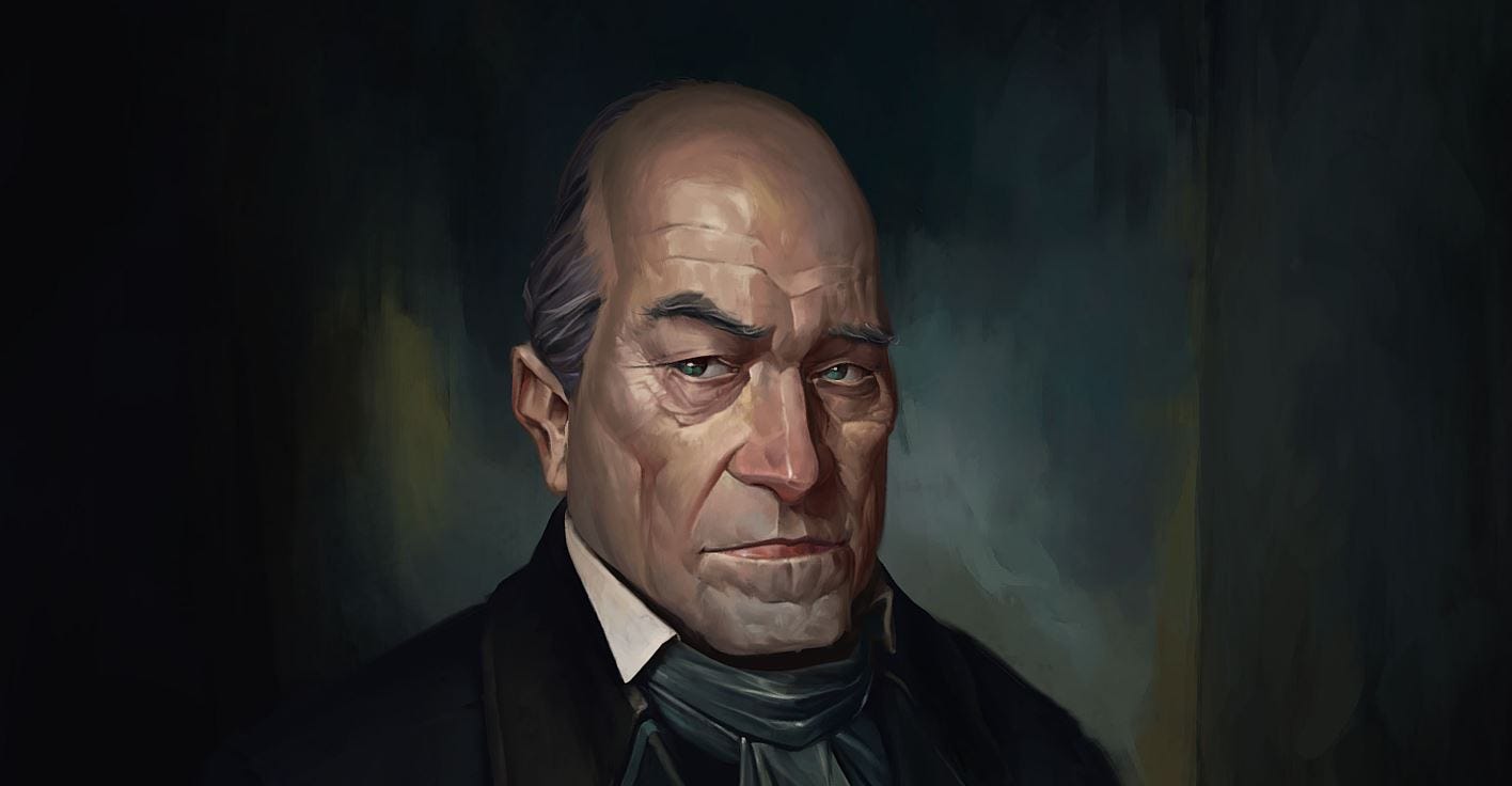
Even doing all the above, you can immediately tell 3D CG apart from a painting due to edge quality. An edge is the area of transition between one section to the other, which differ in their colors. These transitions have various softness. Some are sudden and harsh, others gradual and soft. Look at the self portrait of Rembrandt below as an example and see if you can see the hard and soft edges.

We have soft edges within the textures of the objects, but due to the nature of rasterization, all outer edges of an object are hard! This is probably my least favorite part of computer graphics, and it throws me off on a lot of beautiful scenes.
You can mitigate these by placing transparent faces around the silhouette of an object to add soft edges there too! A good example are the following four 3D models on Sketchfab: Top left, top right, bottom left, bottom right
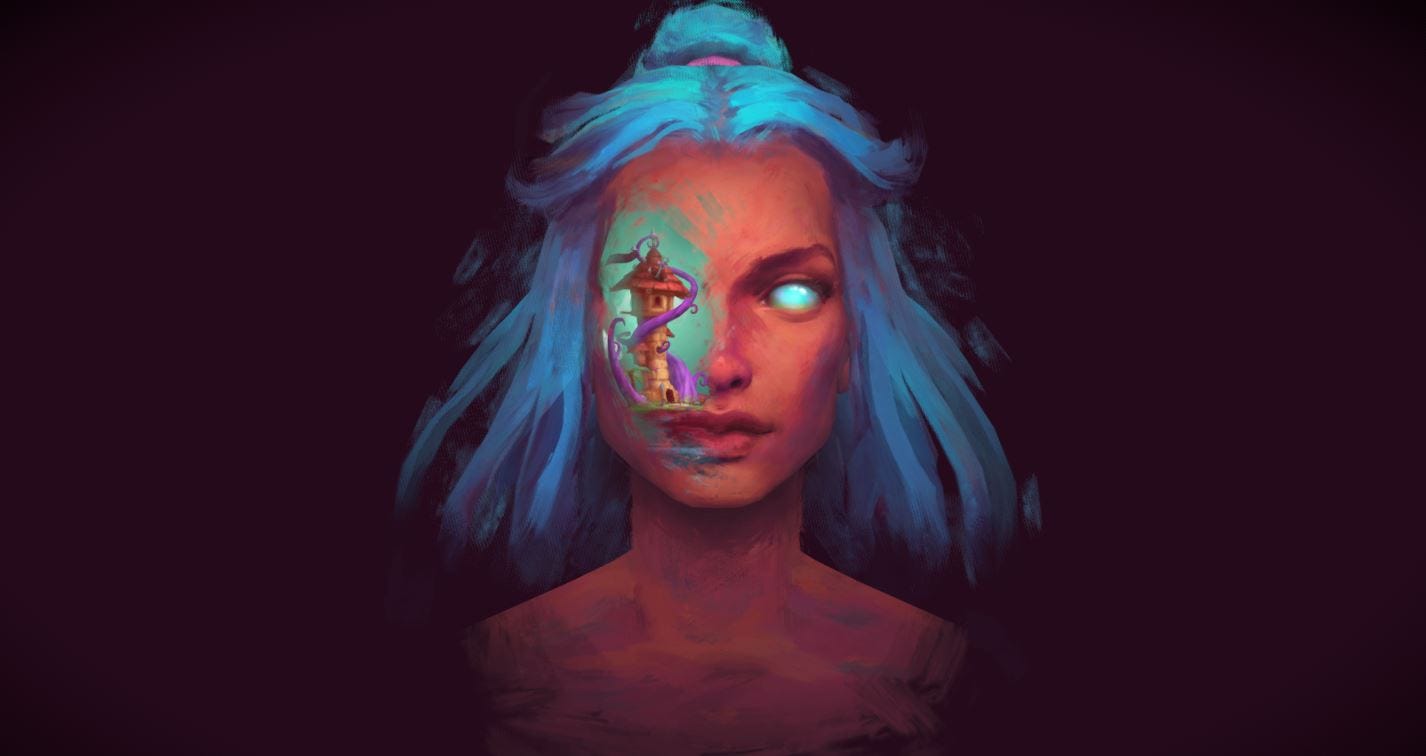


Of course, you can also generate these faces in shader and place them around your characters, similar to the technique used to add detail to the tree trunk’s silhouette in Speed tree. The challenge is to keep a temporally coherent transition as the camera moves around the object.
It is worth mentioning that some rendering pipelines like Playstation Dreams don’t suffer from this problem. The splats can easily represent edges of various quality wherever required.
Projection
We render our scenes based on the assumption of a mathematically perfect pinhole camera. This camera has a shutter setup where images are captured from a frozen point in time and space. Unfortunately, human vision doesn’t work like that. The image we form in our mind is an integration which spans across different spatial/temporal perspectives and even memories and emotions dating back years. Or expressed in simpler terms, we don’t have shutters which open and close, our vision is a lot more dynamic, constantly changing where it focuses and what it captures. We don’t observe a frozen world, but always one where time is flowing and things change. Our brain takes a continuous stream of information, and creates a coherent image of the world. The brain goes back and forth in time (or at least our fake mental perception of it), adjusting our memories and manipulating our perception of time and space.
If you look at a tree in spring time, your experience of viewing this tree is very different to just the visual information recorded by your eyes. Your brain taps in your memory and I bet you have a pretty decent idea of how the tree looks like from the other side, how it moves in the wind and how it feels to touch. It evokes the concept of spring, and how it feels to be alive in these wonderful times. All this is what you experience in the moment you look at a beautiful green tree in spring. And this experience is what the painters try to paint when depicting a tree.
The linear perspective projection showcases a dead space where everything is static. Painters consciously break the rules of linear perspective, even in western art, where up to impressionism, linear perspective played a very important role. They break the rules to get rid of the feeling of the dead static space in their images and bring it closer to the human experience. The way they bend the rules is through integrating various perspectives bashed together on the same image. Chinese and Japanese art do this on a whole different level, since the cultural focus of their paintings has always been to capture the essence of an object rather than how the object appears to a single individual, in a single moment of time from a single perspective.
The images below all use multiple perspective/projection matrices and horizon lines.


Games equally don’t have to follow the machine precise projections we use to imitate cameras. One of my favorite examples is this level from the game The Nine Parchments.
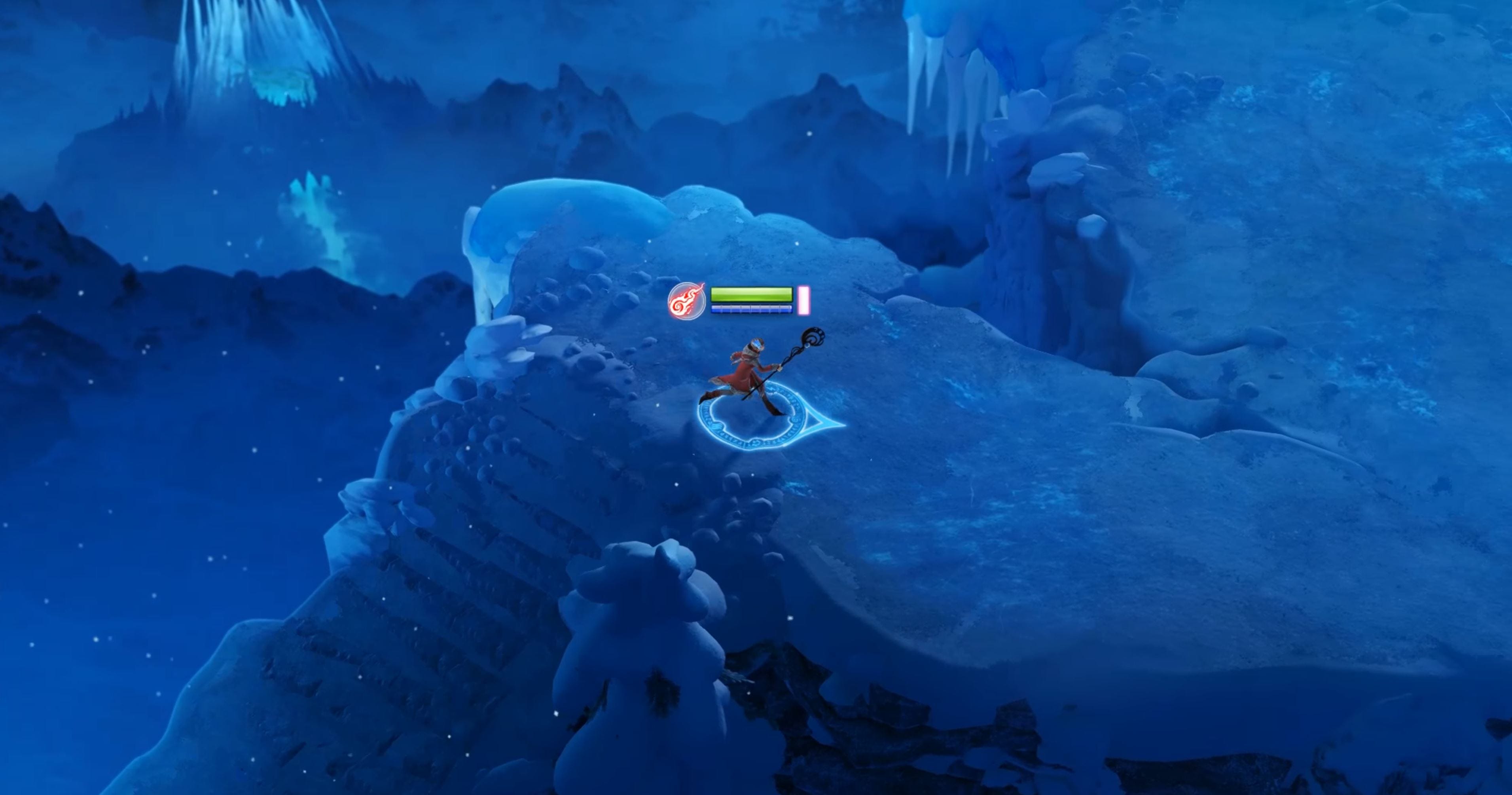

If you pay attention to the background, you will notice this scene has a bunch of physically impossible perspectives bashed together.
Have you ever taken an image of a location larger than life and been disappointed with how lame it looks in the photo? A big mountain, a scene from a vantage point, deep spaces… In the scenario above, if they would have done an accurate projection, you would have seen almost nothing of the mountains behind it. These are very large mountains and there is only so much you can fit on your image.
By using different perspectives, which we associate with large mountains for the background, not only do they showcase the grandeur of the mountains in the back, but also by extension give you a sense of great height for the play area. This image accurately represents the feeling and the visual experience you would have standing on a platform like that. In my book that is the highest form of realism, as it imitates and communicates the experience of a real human being, even if it deviates from photorealism.
Here is another example from the game Transistor, and Hades. Again notice how the horizon is from a different projection than the elevator and the character.
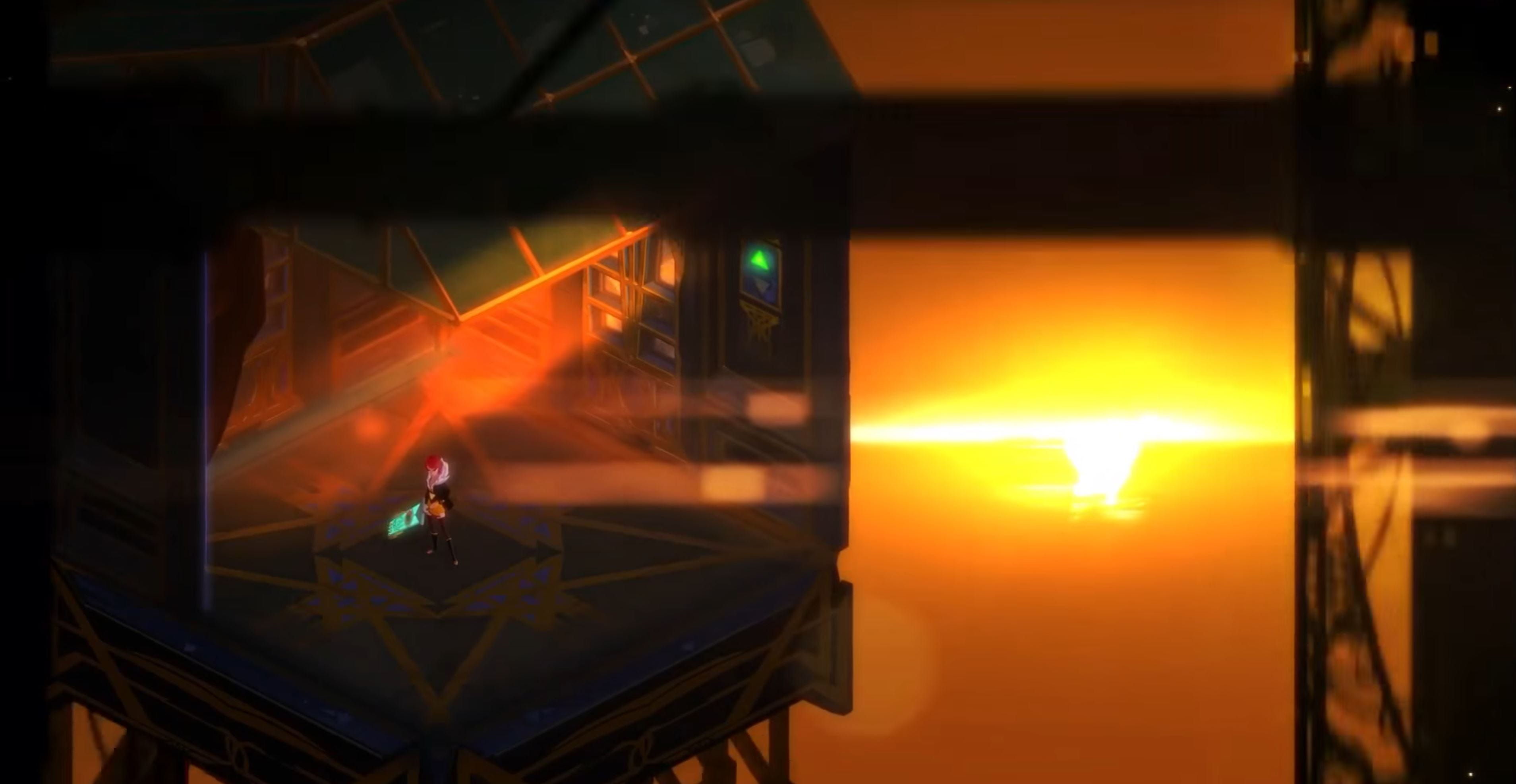
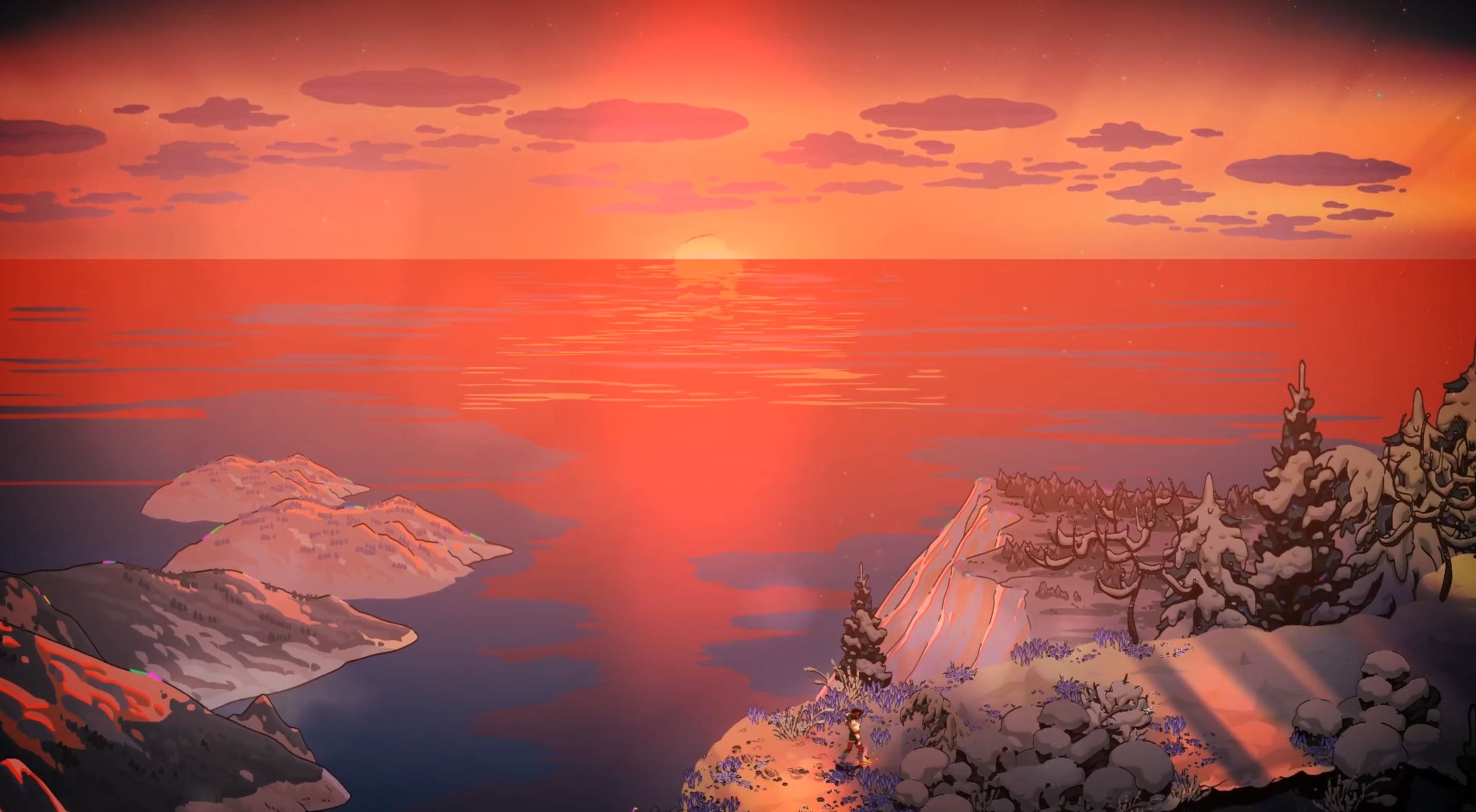
For your NPR scene, you might want to go the extra miles! Freeing yourself from the rigid camera projections and start mixing different projections together to better imitate the experience you want to convey. This will make your scene a bit more like a painting.
Conclusion
Photorealism is perhaps more concerned with making games for cameras than humans. As machines integrate themselves more and more in our lives and how we understand the world, perhaps the difference between the human and machine experience will become irrelevant. For now though, paintings still look more real to me than photos. Games can take some notes from painters. By carefully composing lights, colors, textures, edges and spaces, games could deliver visual experiences that go way beyond what is on the screen.
I hope you enjoyed reading this. This was a different blog post compared to my usual stuff, though my blog remains a diary of things I am learning. You can follow me on my Twitter: IRCSS